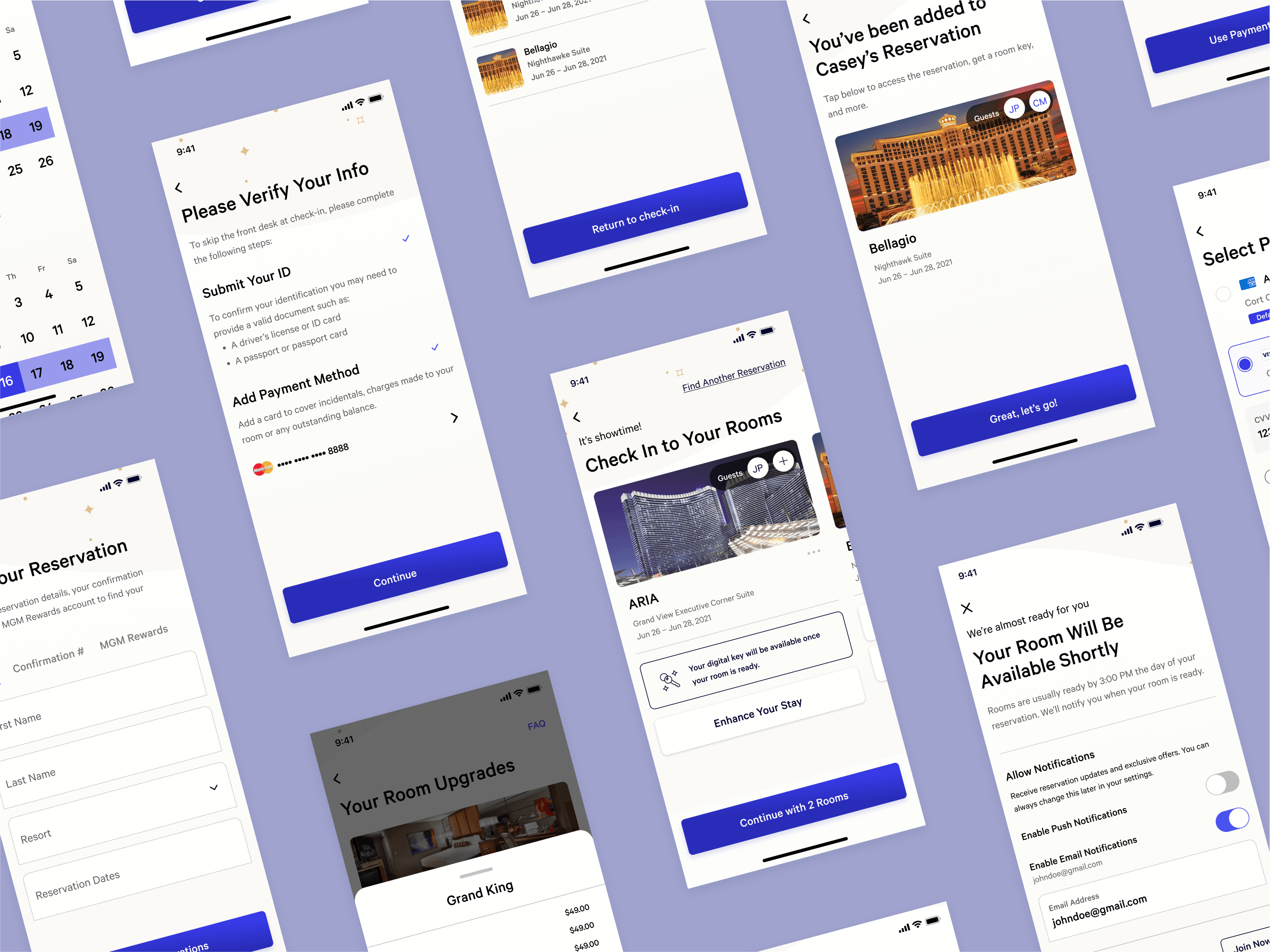
Redesigned mobile check-in screens

Resort pathfinding functionality
MGM’s mobile check-in had a big drop-off issue, with ~40% of guests abandoning the process for front-desk assistance. Cross-referencing app data and guest feedback revealed frustration with excessive screens and clicks, especially at high-friction tasks like ID verification.
To address that, I streamlined the process from 21 steps to 7, prioritizing engaging tasks like trip customization first and delaying high-friction tasks to the end, which gave guests time to feel invested and created a natural save point. Within 3 months of launching the redesign, daily drop-offs had decreased 53%, trip add-on revenue was up 8%, and average check-in time had fallen 55%, saving over 4 million minutes annually across 1.1 million check-ins.
Redesigned resort stay main page and digital key
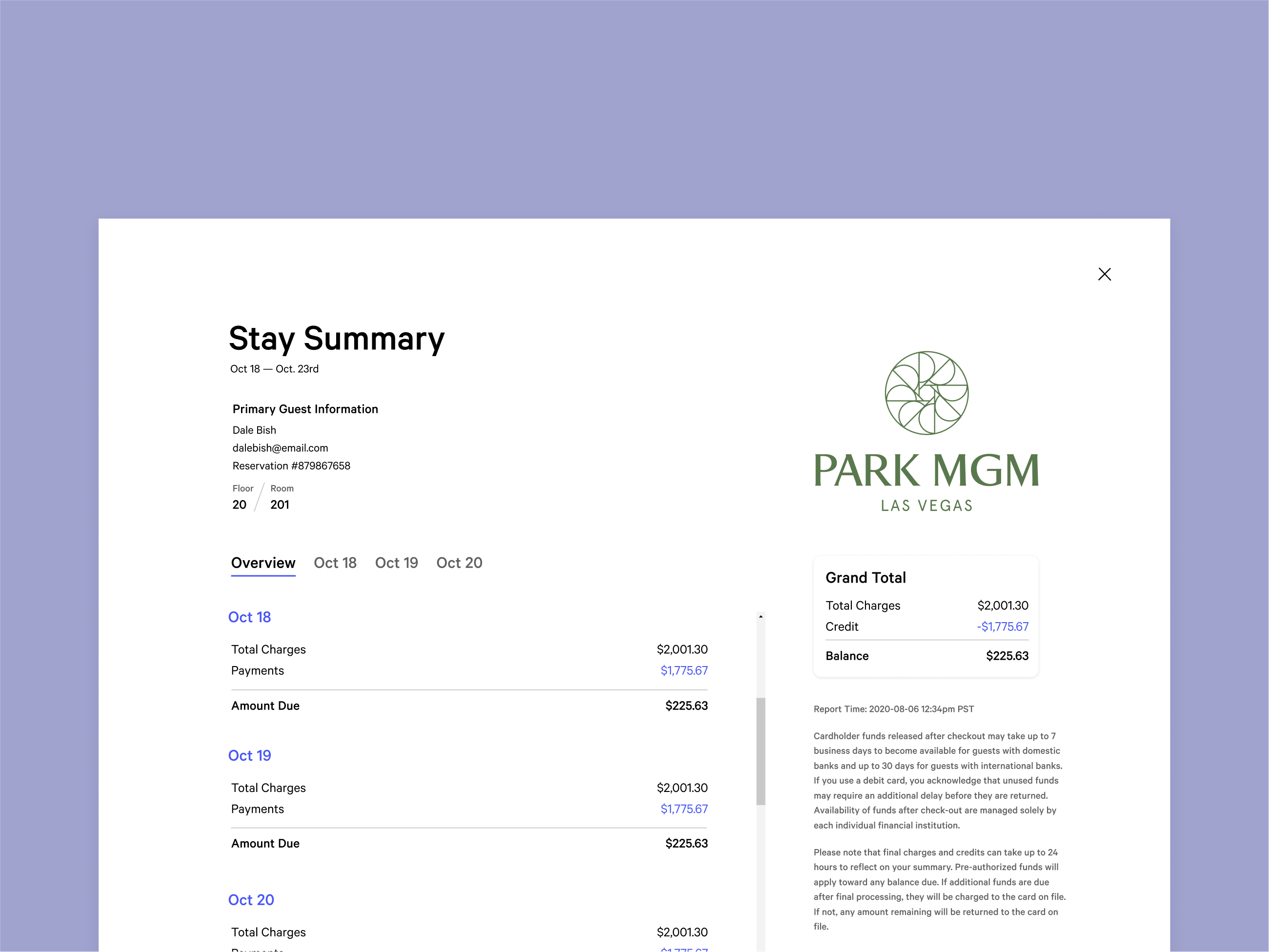
Redesigned stay summary, which breaks down a resort stay bill

Redesigned homepage
Post-check-in drop-off was also common, as the homepage changed dramatically from a static hero to a button grid with stay-related functionality. Proposing improvements was challenging, as they impacted multiple teams across the company.
To solve this, I created weekly office hours, which offered teams a low stakes arena in where they could discuss shared goals. It allowed me to gradually arrive at consensual designs, featuring modular components that adapted to each stage of the guest journey, keeping the homepage's UI consistency through a guest's stay. At a usability test, the designs displayed a 90% success rate of participants successfully using the homepage to navigate their stay.
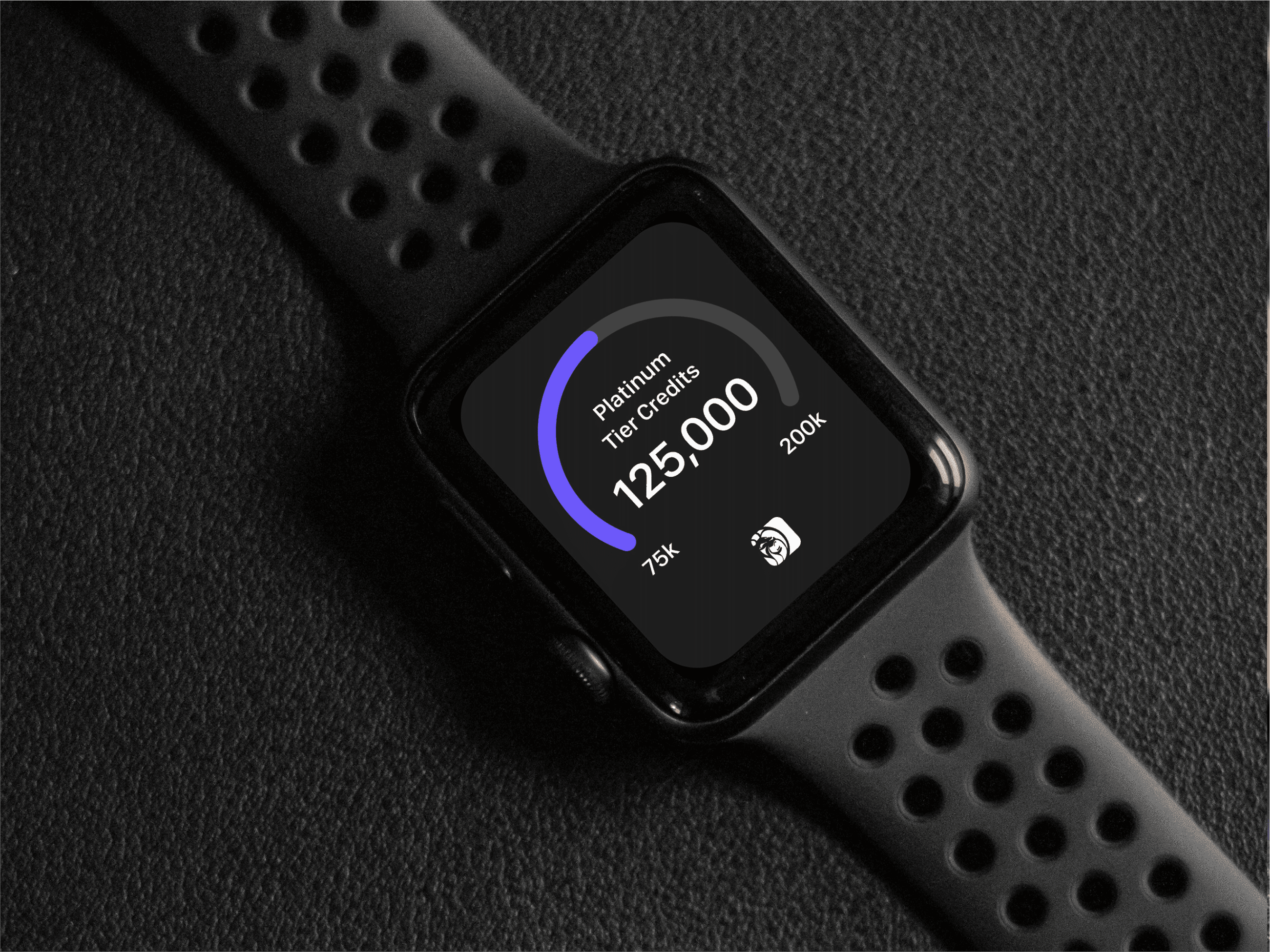
Resort app concept for the Apple Watch
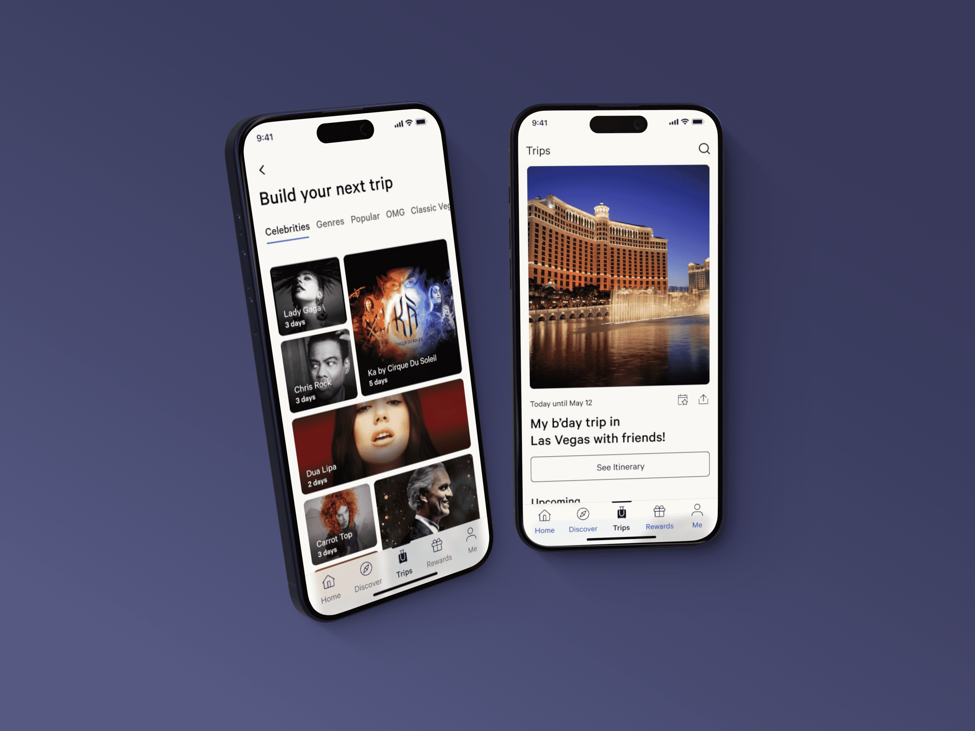
Redesigned trip building and managing
Guests often sought front-desk help because of problems with their mobile room keys. Analysis of guest feedback revealed opportunities to provide clearer context and better manage expectations, e.g., preventing guests from assuming the app had crashed while waiting for the door to unlock.
My solution enhanced existing graphics, animations, and text to clearly communicate guest actions and ongoing processes, and added strategically placed functionality such as a button to reveal room information. Without requiring a full rebuild of the digital key, these enhancements allowed the team to leverage existing UI components more effectively, while increasing guest autonomy and overall experience.
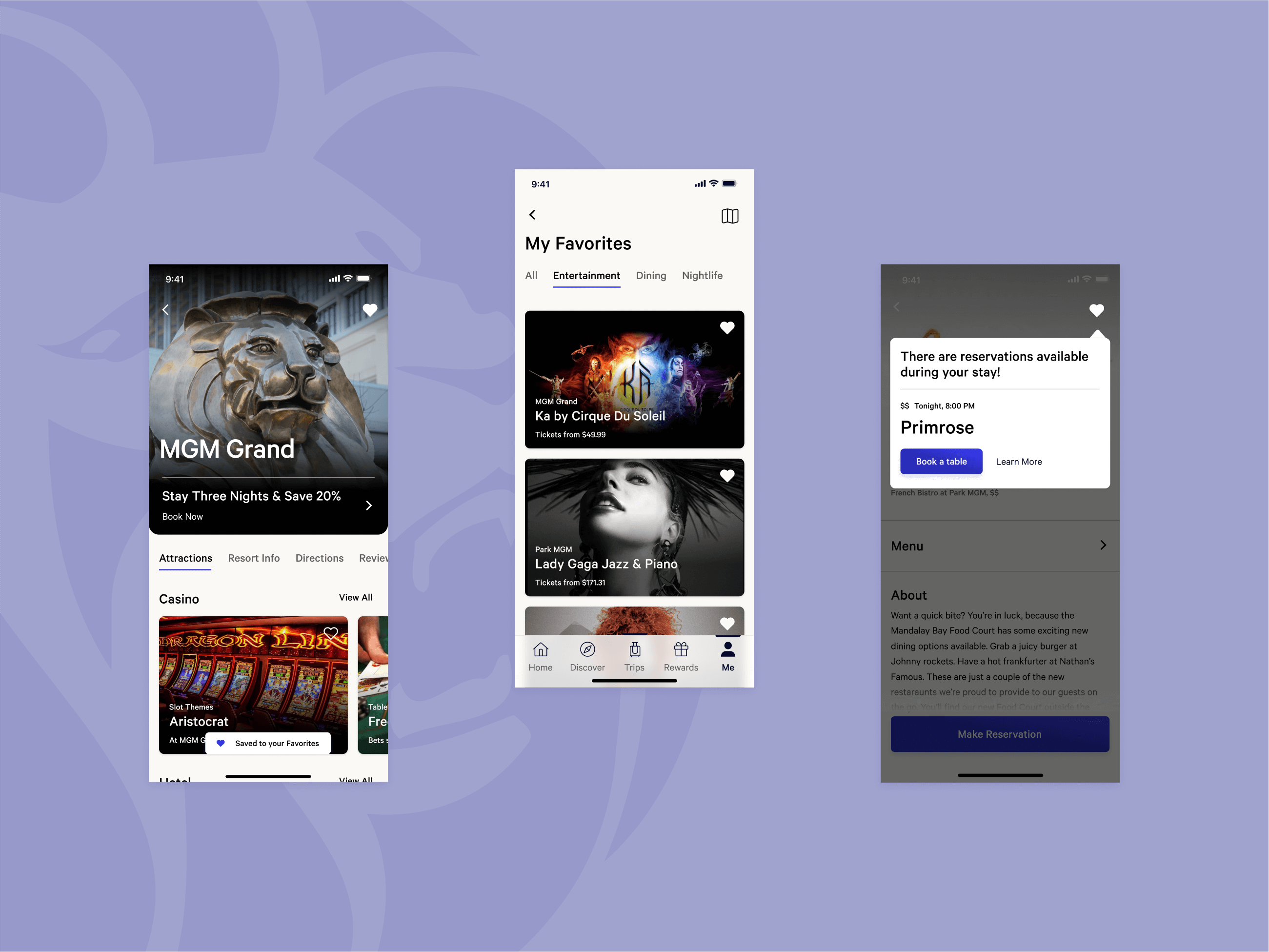
Bookmarking functionality for resort discovery, which allowed guests to create wishlists
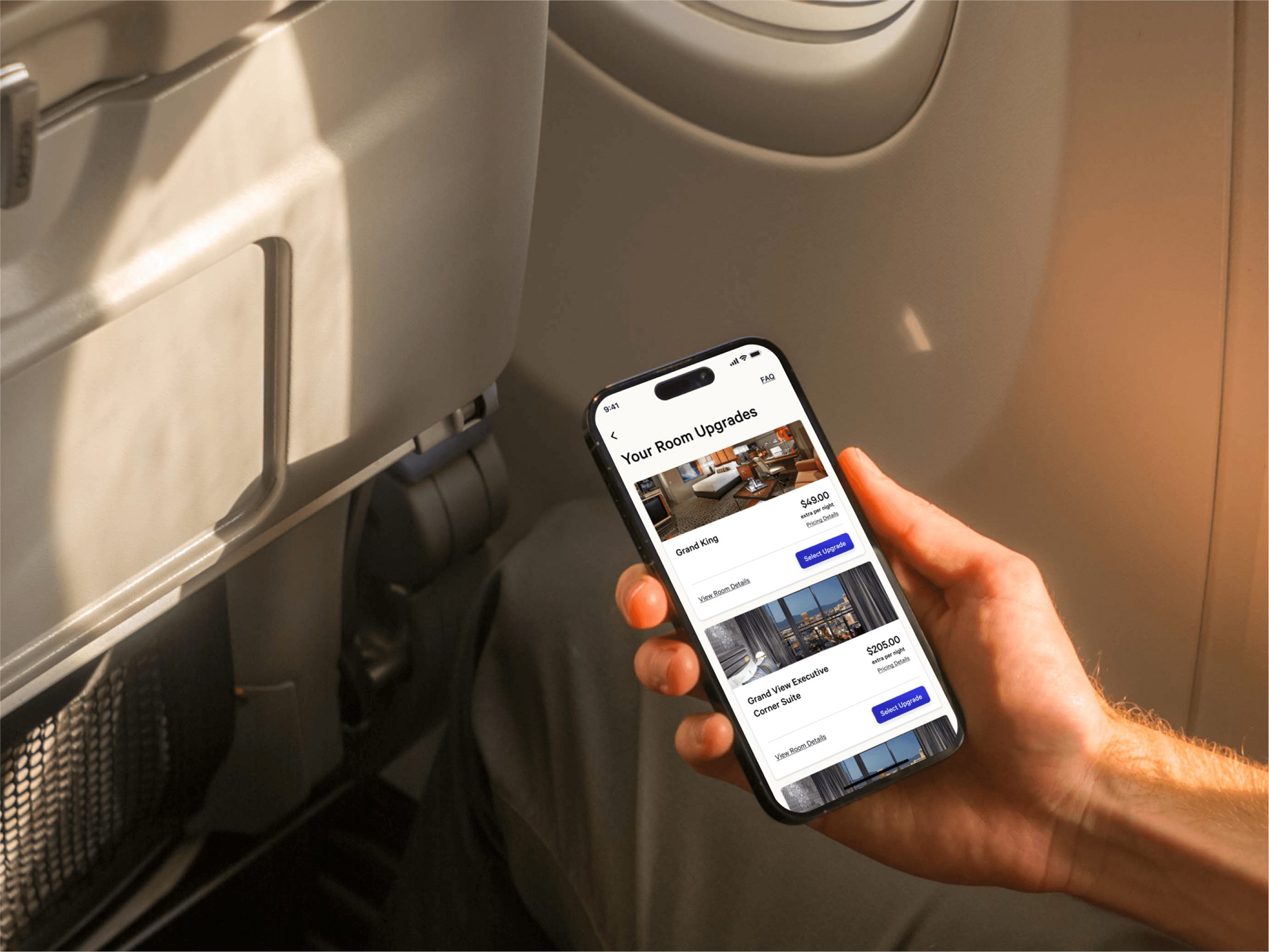
Room upgrade functionality
Tooltip intro, announcing the launch of the trip management feature
I provided contributions to other areas of the app, including trip management, in-app messaging, and resort discovery, improving their usability and ensuring consistency across the mobile experience.
In addition to that, I coordinated efforts with the Web and Brand teams to help update the app to the company's new Vega design system.
As the redesign efforts started showing results, the team expanded, and I was able to also help recruit, onboard, and train new designers.